Puddles of Sky Press
  • Home
  • Chapbooks
  • Chapoems & Postcards
  • Submissions
  • Contact Us
  • Other Publications by Michael e. Casteels

Book of Cedar; Letting the Poem Speak for Itself

6/1/2018

 
Picture
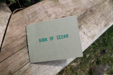
Last week I made a trip into Toronto to read with Guy Ewing at the Field Trip Cafe. We belatedly launched his autumn 2017 chapbook ocean in a cell. A few weeks before our reading, I contacted Guy and asked him to send me a single poem that I could publish. I wanted to make something quick and simple that we could give out for free at the reading. He sent me his poem Book of Cedar and I sat with it for a while trying to figure out the best way to publish it.

Initially I wanted to create something like a bookmark, or a postcard... something that I could make 100 copies of in an evening. But the longer I sat with this poem, the more it spoke to me, and I felt like the poem was directing me toward something else.

The poem itself reads:

                                           book of cedar
                                                   sways across the sun

                                                                    page
                                                                             page


The 'pages' in this poem really pushed me toward making a small booklet in which each 'page' gets its own page. To me, it felt like the poem Book of Cedar needed become a book itself.

I rummaged through my stacks of paper and card stock. I found a textured green card stock for the cover, something that would speak to the tree in this poem. I also found a package of rice paper that I'd purchased in Montreal 3 years ago, but never found the right project for. The rice paper is lovely, because it adds a level of transparency, so the poem's original layout can still be seen. The paper is very delicate though, and required cutting by hand, rather than my usual guillotine paper cutter. It was a long process to measure and cut the sheets down to size, but it was also a quiet, methodical process, giving me time to ponder the poem and really appreciate it.

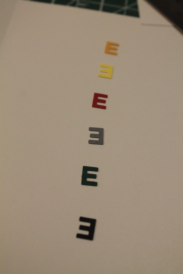
The stamping process was easier than expected. I was worried that the paper might not take the ink very well, but each stamp came out clean, with very minimal bleeding. To keep with the minimalist nature of the book, I tucked the publishing information on the inside the back cover, as close to the spine as I could, to keep from cluttering up the pages.

Lastly, since the poem and book had now become one, I wanted something to house the poem-object in. I have a giant stack of envelopes that I thought might be useful, and to my surprise, with only one cut, the book fit in perfectly.

As a publisher and book-maker, it's a real joy to find work that speaks to you. In this case my initial concepts for the publication were entirely shifted because of the poem itself. It's great to work with someone who is so open to this kind of collaboration, someone who is equally as excited to see their work become physical, and something vastly different from their expectations.

Book of Cedar can be purchased for $4.50 + shipping on our CHAPBOOKS page.

99 cents (that's the title, not the price)

4/24/2018

 
Picture
The idea for Puddles of Sky's ongoing Off Cuts & Loose Ends project came while working on Andrew Topel's chapbook Framework. The cover of his chapbook features a 2 inch by 2 inch cutout that reveals a portion of the title page behind it. The result left me with 80 2 by 2 squares that I couldn't bring myself to throw away.

I'd been waiting for over a year to find the perfect project to use these in. In March my wife Allison took a trip to Boston, and she returned with a short poem titled 99 cents. I read it and immediately knew that this was the project I'd been waiting for. The poem is mysterious, funny, and a little dark. For a poem of it's size it can do a lot of different things.

The chapbook came together pretty easily, since I already had the covers ready. The interior pages came from a notepad called 'Poo Paper' which is essentially elephant feces turned into fine paper.  I was delighted when I realized that the pages of this notebook were 8 by 8, and when quartered fit perfectly with the 2 by 2 covers.

The rubber stamping was simple enough, a single word to a page. The cover required a white label, and I went through each of the possible ink colors before settling on red.

The only formatting issue I struggled with was the binding. Due to the miniature size of this publication certain bindings were ruled out pretty quickly. I knew I couldn't use staples, they'd be incredibly tacky, and too quick for a chapbook like this. Also, a Japanese binding didn't work, as the margin needed to be minimal. I finally decided to attempt the binding by using Allison's sewing machine.

I'd done a little sewing in the past, so the machine wasn't completely foreign, but the book binding needed to be clean, straight, and double-stitched, so I practiced for a while until I felt quite comfortable with the machine. I still had a few mishaps with the first few copies though, which unfortunately dropped the print run. After about 10 or 12 bindings I realized that I needed to tie off the loose threads at the end, and once I started doing that the sewing became easier and more consistent.

It's great to have a new tool to use for Puddles of Sky Press bindings. I'm already thinking of new uses for this machine... What's that stitch-selector do anyway?...


99 cents by Allison Chisholm is being sold for $4.50 + shipping. Find more details on our CHAPBOOKS page.


DuD, a successful spark

3/20/2018

 
Picture
Sometimes the idea for a chapbook takes weeks or months to gestate. Some ideas spend years in the formative stage. Sometimes, however, the idea strikes, and the chapbook is executed in the span of a few days. This was the case for my most recent publication: DuD.

For the past few years I've been slowly working on a short, but involved, manuscript of dry-transfer visual poems, inspired by the work of derek beaulieu and bpNichol, among others. The process of this work is exciting, but can also be laborious and monotonous, which is why this project has taken so long. Recently, I've been engrossed in this manuscript, spending a few hours a night rubbing letters onto a page.

DuD occurred quite suddenly. I'd begun a piece for my manuscript, and it came out as an unexpected three-word poem, which was unlike any of the other poems I'd created. Looking through my limited selection of alphabets and fonts I was immediately struck with an idea for a brief series of poems playing with this word. Within a half-hour the poems for DuD were complete.

For the creation of the physical chapbook, I wanted something just as quick and playful as the poems themselves. I've had this stack of neon-pink card stock for a while, and it seemed like the perfect opportunity to use it. I also wanted to create something less-elegant than my other projects, so no saddle-stitching or sewn bindings on this piece, just two staples punched in. I liked the minimalist design, but felt obliged to include some publishing information, which is rubber-stamped inside the back cover, tucked closely to the spine.

I'm quite happy with this little book. It's fun to see how one project can spark another, and how quickly that spark can become something physical.

You can find out more, and order DuD on our Chapbooks Page.

Transmissions from Outside the Vacuum

2/26/2018

 
Picture
My creative process relies heavily on solitude. The majority of my writing happens when I'm alone, in a quiet space, and quiet frame of mind. Most of my chapbook production occurs late at night, when the apartment is quiet and even the pets are asleep...  Sometimes I'm sitting with a single poem for hours at a time, or cutting eight-hundred sheets of paper down to size, or struggling between a semi-colon or a comma or a period, or sewing bindings fifty at a time, so it's not surprising that I often feel like I'm working in a vacuum.

But this past month my mailbox has been reminding me of what a strong community small press publishing is. I've received a handful of packages this month, some ordered, some traded, some long-awaited,  and some completely unexpected.

Here's an inventory of the goods:

Touch the Donkey 16 ed. by rob mclennan, and  small bed & field guide  by Valerie Coulton-- sent to me from rob mclennan, whose above/ground press is celebrating it's 25th anniversary this year. In fact, rob may have even sent me another package  this month. It's hard to keep up with what he's doing. And he's been doing it for 25 years!

EXPLOSIVE COMIC-- sent to me and by Mark Laliberte. I'd been looking forward to reading this collage-comic-visual-sound-poem for a while now, and was entirely blown away! Mark is the editor of Carousel Magazine, one of my favorite literary magazines, and one of only a few magazines I read cover-to-cover.

ULULATION by Robert Keith and phiLosophy and untitled visual poems-- by Sacha Archer, from his Simulacrum Press, which is creating beautiful, original, and insightful chapbooks. Having published it's first project in November of 2017, Simulacrum's list of publications has already risen to six titles, from chapbooks to posters to boxes filled cards. I'm excited to see what else is on the way.

Quantum Typography by Gary Barwin, and isostatisk landhojning by derek beaulieu and postcard by Van Jun-- sent by Joakim Norling from his Timglaset Editions. Timglaset is based out of Sweden and publishes primarily visual/concrete poetry. Joakim seems to be filling a space that is relatively unoccupied in that part of the world, and it's exciting to see that his most recent publications are from Canadian small press friends of mine. Also, shipping from Sweden is a lot less than you'd think!

Still Water by bp Nichol-- ordered from Tony Power Books. I'd been waiting a few years to see this title come up through BookFinder. I'd seen it once 5 or 6 years ago, and then hadn't seen it again until just a few weeks ago. I love a publication without a spine. Still Water is a small box that contains 28 cards, printed with short visual poems. It was published by Talon books in 1970, and it makes me think of the 70's and 80's when small presses were producing some pretty wild and atypical publications. Publications that, for reasons to numerous for me delve into in this blog entry, would never get printed today. It reminds me that chapbook presses can still publish just about anything we can imagine, and that thought is pretty liberating.

Faunics by Jack Davis-- sent to me by the author. I don't know Jack Davis, but I consider him a friend. A few weeks ago I received a chapbook order from Jack, and emailed him a shipping confirmation with thanks. He sent me a really nice response in regard to some of my writing, and that was that. Then last Friday, when I was packing for a long-weekend-cabin-getaway and trying to figure out which book of poetry to bring along, the mailman stopped by to deliver an unexpected package. I was thrilled to find Jack's book inside, along with a really lovely letter. I've been reading through his book slowly and thoughtfully, the way I'm sure it was written. His poems are amazingly dense and mysterious minimalist pieces. I'm absolutely in love with them, and highly recommend everyone pick up a copy of this book, even though I'm only halfway through.

I feel so fortunate to be a part of such a thriving and generous small press community. These physical objects help connect me to the outside world, reminding me that I'm a part of it, especially when I get the feeling that my apartment is air-locked, and floating on the fringes of the known universe.

Wet Cement-- Concrete Poems in Flux

2/15/2018

 
Picture
Picture
Picture
Picture
Picture
My most recent project, Wet Cement, came to me through two materials, both given to me by friends, and neither of which I could figure out what to do with on its own. The first being a booklet of paper samples from the Strathmore Paper Company, and the second being a pair of Martha Stewart Alphabet Punches. The samples pages were all different colors, textures, and sizes, which made it impossible to create a project with any consistency. The punches were difficult to use because the letters couldn't be punched out individually; one punch contains the first half of the alphabet, and the other punch contains the second half.

I remember I was standing in my living room, and my wife, Allison, asked me what I planned to use the Alphabet Punches for, and I said, "I have no idea," and then the idea suddenly rushed in, like I was receiving a transmission from another planet.

Essentially, Wet Cement, is a collection of concrete poems that have yet to set. Published in an edition of 38, each copy contains 3 unique poems. The letters to each of these poems are housed in individual envelopes. Because of the varying colors, shades, and textures of the paper, no two poems are identical. Some share similarities, but most are vastly different from one another. It's important to note that the poems are more than just random assortments of letters. Each one was composed with one of three general ideas in mind. 

A. Is a poem based on text. This could be a visual haiku, creating a scene or a snapshot of a moment. It could be a one-word poem. Some of these pieces were based off of poems by Basho, Aram Saroyan, Nelson Ball, & bpNichol.

B. Is a poem based on texture. These are, for the most part, larger pieces. In some poems the idea of texture is approached through color. In other cases, the shapes of the letters. Sometimes it's a combination of the two.

C. Is a minimalist concrete poem.

When I started working on this project, I hoped to photograph each poem as it was completed; a sort of visual index. Because each poem is unique, I think I'm going to feel a small loss each time I sell a copy. How many poems do we write, that we pass on, never to hear from again? I did take a few photographs, but not as many as I'd originally hoped. While looking over those first few photos, I realized that the static images were nothing like poems themselves. The poems were fragile. Stalled, but still in motion. Frozen, but about to be thawed. Paused, but about to be rewritten into a pile, then dumped back into the envelope, where it will be a poem that no one will ever read.

Wet Cement is being sold for $12.00 + shipping. Check out our CHAPBOOKS page for more information.

Cloud Cover -- a postcard poem by Conyer Clayton

2/6/2018

 
Picture
Last night I finished stamping 51 copies of a new poem by Ottawa poet Conyer Clayton.

This was fun little project to work on. I've wanted to publish a series of postcard poems for a while, but haven't had the right poem to kick start the project.

Cloud Cover is a lovely poem with a lot to think about. I like the word 'tries', and all that it implies. I especially like the idea of a postcard that seems to encourage forgetfulness, since they're usually a means of remembering a specific time/place/event.

This was the first project in which I carved my own stamp, so I decided to start with a pretty basic cloud shape. The challenge was getting the inking consistent, and not too heavy, so the title could show through the blue. There are a few variants in this project, which should be expected when rubber-stamping. Overall, I'm really pleased with how this postcard turned out, and I'm looking forward to working on Puddles of Sky Postcard #2.

Cloud Cover can be ordered HERE.


snowfall, my minimalist dilemmas

2/1/2018

 
Creativity begets creativity. After completing my print-run of EARTHQUACKS & other one-word poems, I was inspired to continue with my publishing ventures.

I've recently completed a 20 copy print-run of a small, minimalist poem-object entitled snowfall. Each poem and envelope was hand-struck on a Hermes 3000 typewriter.

I had a few minimalist-dilemmas while working on this piece. As you'll see in the photos, only the title appears on the front of the envelope. I felt like including my name, the publication date and publishing information would have cluttered this otherwise very minimalist publication. I also didn't want to include it on the poem itself for the same reason. I decided to include that information on a small colophon card, tucked into the envelope, but detached from the poem/object itself.

You might notice in one of the photos that I've got an iron and ironing board beside my typewriter. As I typed up the envelopes they came through the typewriter a little wrinkled and needed to be flattened out afterwards. This is the first publication I've ever done that required ironing, but it definitely helped to keep the envelopes looking flat and clean.

You can find more information and ordering options on our CHAPBOOKS page.

Another project is in the works. More information on that soon!

EARTHQUACKS: a blog entry

1/18/2018

 
I'd almost forgotten that one of the great joys of running a chapbook press is the ability to publish on a whim. Specifically, the joys of self-publishing on whim. When I first started self-publishing chapbooks I'd be struck by an idea one night and by the next morning I'd have produced fifty-copies of something. Literally. I'd be up until 3 or 4 am, printing, folding, stapling... and I'd have something to give out to friends.

While I know that the quality of my work has come as a long way since those early days, sometimes I overthink projects to the point of procrastinating them out of existence. With others' work this happens less often, but with my own it's very easy to projects slide.

I'm hoping that 2018 will be different. I've started the year off pretty well with the publication of EARTHQUACKS & Other One-Word Poems. I'd had the idea of doing a small collection of one-word poems for a few years now. This past weekend I had a free night, so I finally decided I'd start working on it. I put in some long nights, played some records and stayed up stamping until 3 am, and within 3 days the project was finished.

I'm really happy with this little publication. I had some nice surprises while putting it together. I had no idea what the title was going to be until I started stamping. Poems got swapped out at the last minute, which really changed the tone of the project. I'd imagined each poem would be printed in lower case in black ink, but I ended up printing in upper case in blue ink.

That's another one of the joys of publishing like this. Sometimes the publication gets to decide how it'll look. I just have to agree and stamp away.

Stay tuned, friends. Lots more to come in 2018!

Michael e. Casteels reads from Lagoon. Still Lagoon.

1/3/2018


Fall 2017 Titles now available!

11/30/2017

 
The last month has been a whirlwind of paper, cardstock, rubber stamps, staples, thread, etcetera... but now the fall 2017 titles are all finished and ready to be ordered. We're really thrilled with how our chapbooks have turned out and we think you will be too! We've got a collection of visual poetry by Amanda Earl, a new gathering of prose & lyric poems by Michael e. Casteels, and a tiny chapbook of rubber-stamped minimalist pieces by Guy Ewing. Check out our CHAPBOOKS page for more info. And keep watching this space. We've got more great things coming down the pipes!
<<Previous
Forward>>

    Welcome. Please take your shoes off at the door.

    About

    a micropress run by micropeople with enormous aspirations.

    Archives

    December 2024
    June 2024
    December 2023
    June 2023
    April 2023
    December 2022
    November 2022
    September 2022
    January 2022
    December 2021
    November 2021
    September 2021
    August 2021
    June 2021
    May 2021
    April 2021
    March 2021
    February 2021
    December 2020
    November 2020
    November 2019
    January 2019
    July 2018
    June 2018
    April 2018
    March 2018
    February 2018
    January 2018
    November 2017
    August 2017
    May 2017
    January 2017
    December 2016
    November 2016
    July 2016
    May 2016
    April 2016
    March 2016
    February 2016
    December 2015
    October 2015
    September 2015
    June 2015
    May 2015
    April 2015
    March 2015
    February 2015
    January 2015
    December 2014
    November 2014
    June 2014
    May 2014
    April 2014
    February 2014
    December 2013
    October 2013
    September 2013
    July 2013
    June 2013
    May 2013
    April 2013
    March 2013
    December 2012
    November 2012
    September 2012
    August 2012
    July 2012
    June 2012
    April 2012
    March 2012
    February 2012
    January 2012

    Categories

    All

    RSS Feed

Wub Hosting by iPage